

Minnesota officially has a new state flag, but how does it compare to other flags? All Things Considered host Tom Crann spoke with Ted Kay from the North American Vexillological Association about it. Kay wrote the guidebook ŌĆ£Good Flag, Bad Flag.ŌĆØ
The following transcription has been edited for length and clarity.
ADVERTISEMENT
Give us your initial reaction to the final version of the new Minnesota flag.
ItŌĆÖs an outstanding design, and Minnesotans will come to love it.


That's a really nice review of it. So what makes you say that?
ItŌĆÖs simple, itŌĆÖs meaningful, it has just three colors. It has no lettering or seal on it and itŌĆÖs very distinctive, you should be able to make it out at a distance it should be discernible. And then when you see it, you should be able to remember that whatŌĆÖs on the flag represents the place that it symbolizes.
This design accomplishes those things. At the same time, this is the only flag that I know of certainly in common use, that makes use of that shape that echoes the shape of the state of Minnesota.
Earlier versions of it had three colors on the side. I sort of long for that I was hoping that one would get through. Do you think itŌĆÖs better with fewer elements?
That is correct. I understand the enthusiasm for green but there are two challenges with the inclusion of the green on the flag.
ADVERTISEMENT
The first is that it didnŌĆÖt contrast very well with the dark blue next to it, meaning, every place has green. Every place has their rural or their connection to the land. So thatŌĆÖs not very distinctive for Minnesota.
What is very distinctive from Minnesota is the land of sky blue waters,10,000 lakes, the Mississippi River ŌĆö the light blue field on the flag tells that story from Minnesota very effectively.
And the star, the North Star, and that design actually is in the capitol rotunda as well. The points of the star look like MŌĆÖs.
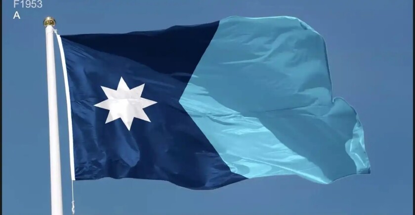
ThereŌĆÖs several things going on in that star, which we can call the Minnesota star. One, itŌĆÖs an eight-pointed star, which means it echoes a compass rose and it points to the north. So it reflects Minnesota in that North Star State.
The second is that itŌĆÖs a Dakota image, you can see it in native iconography. The third is you can see that form of star on barns in southern Minnesota. So three different meanings come together in that star. For those who want to see them, there are four MŌĆÖs in that star as well
As state flags go, how does MinnesotaŌĆÖs new flag rank to you?
I think itŌĆÖs going to be in the top 10. When NAVA polls the public and its members on state flags, the best, simplest designs popped to the top. South Carolina, New Mexico, Texas, Arizona, Colorado, Alaska, Washington, D.C. ThatŌĆÖs the club that MinnesotaŌĆÖs flag will be joining.
ADVERTISEMENT
In any process like this, there will undoubtedly be naysayers. What would you say about that?
ItŌĆÖs a challenge to go from an old flag to a new flag. Canada faced it in 1965. South Africa faced it in 1994. But eventually the new flag will grow on folks, and it will be accepted.
ThereŌĆÖs been a wave of flag redesigns in the last decade, why are people doing this?
The wave of city flag redesign has been set off by podcaster Roman Mars who did a TED talk in 2015 called ŌĆ£Why city flags may be the worst design thing you never noticed.ŌĆØ
WeŌĆÖve counted over 300 cities who have changed their flags in the last seven years.
Tell us why having a good flag matters.
A good flag can help represent the state to the world and represent the state to its residents. So outward looking its branding, inward looking it is civic cohesion. It creates a banner under which the citizens and residents of Minnesota can unite to address the important issues facing the state.
ADVERTISEMENT
______________________________________________________
This story was written by one of our partner news agencies. Forum Communications Company uses content from agencies such as Reuters, Kaiser Health News, Tribune News Service and others to provide a wider range of news to our readers. Learn more about the news services FCC uses here.


